How to design the perfect business card
In the age of social media and email, does the humble business card still count for something? You might think you can do without one for networking and sales, but you’d be wrong.
When you hand a person your professional and modern business card, you build trust and keep the conversation going long after it finishes. Science explains human beings are tactile creatures who learn by touch and interaction, and the business card is a tangible way to build relationships.
As far as brand collateral goes, business cards provide great value for money. Getting your business cards designed and printed is low cost, and their small size means their portable and light weight.
The graphic design of business cards is evolving too, with designers working in features like play to differentiate brands, industries and businesses. As a designer, you have the power to help your clients make a great first impression and to do this, you need to be prepared to break some rules.
In this article, we run through five tips you need to remember to create the perfect business card design. Plus, look out for the bonus 8-step business card infographic to show you how to get there!
1. Understand the fundamentals of design
Before you apply your knowledge of the fundamentals of design, you need to nail the basics. Ensure you get all the contact information your clients needs for their business card:
- Name
- Position
- Email
- Phone number
- Other ways to stay in touch
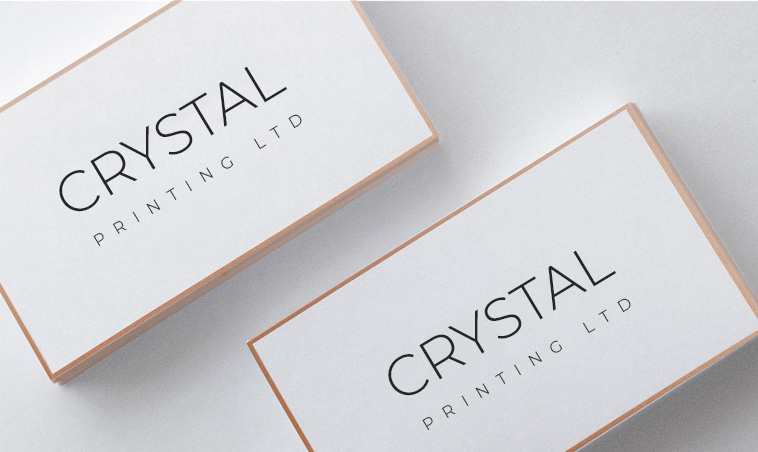
As for the elements and principals of design are concerned, you need to strike the right balance with all the information given. The visual and text hierarchy plays an important role in creating a successful business card. Hot tip: Think about where the eye must land first. The following design strike the balance, creating harmoney between text and visual hierarchies.
2. Create visually striking images
Use strong visual imagery to grab attention and make your business card memorable. For a double-sided business card, use side 1 for contact information. For side 2, have inject some fun and play into your design.
Ideas for Side 2: Feature the company’s logo, include a thought provoking image or quote. Our tip? Impress your client with a cool custom illustration.
3. Don’t forget type and color
Printers use CMYK color so think in 4 colors when designing a color palette. Simple. No other rules other than being fun and creative.
Test if your chosen typeface is legible. You are restricted to such a small card, hence your text must be small. Too small, and no one can read it.
A good rule of thumb is don’t go smaller than 8pt. For small type, avoid descriptive or graphic font. Use a simple and clear sans serif or serif typeface.
4. Choice of materials and card stock matter
Think about the material you will be designing on; shape and the form are important in the design process as well as the thickness of the card (card stock) that will feature your design.
Do consider special finishes, which include cut outs, presses, emboss/deboss, and note that these finishes are dependent on your client’s print budget.
The secret here is not to go overboard and include all the bells and whistles but rather think of how the physical attributes of the card will make your brand stronger. We recommend you pick 1 or 2 special elements that can work together to reinforce your brand. Less is more!
During the design planning stage, take into account paper choices, colors and optional extras like embossing or gold leafing. If you choose to step away from the traditional rectangle shape, which can be a great way to differentiate yourself, keep in mind the practicality of storing the card – will your client carry their cards in a special holder or their wallet.
Keep in mind that the more you customise the materials (size, texture etc) the more expensive production becomes. Also when changing dimensions, for printers it’s technically easier and probably cheaper to reduce the card size than to go up in size.
5. Print with bleed
Don’t forget bleed. Let’s be honest printing is never 100% perfect, this is why bleed is crucially important for creating business cards.
Bleed is printing that goes beyond the edge of your design. Usually, printers require a 3mm bleed. Make sure it is the same color as your background, so the edge of your business cards can be perfect. Place all contact information in the ‘safe area’ (the center of the card) to avoid it being cut during the printing process.
You don’t need to showcase the bleed when presenting your design to your client, however the final file needs to have bleed.
We hope these tips help you to design stunning business cards for your clients.